Setting us up for long-term efficiency by creating reusable components, reducing wasted developer time.
Embedding branding and accessibility.
Writing documentation and guidelines for the cross-functional team.
Time period
December 2022 – June 2024
Team
UX UI designer (me)
Various developers, researchers, designers and CMS managers
1. Starting with the brand identity
Colour and typography
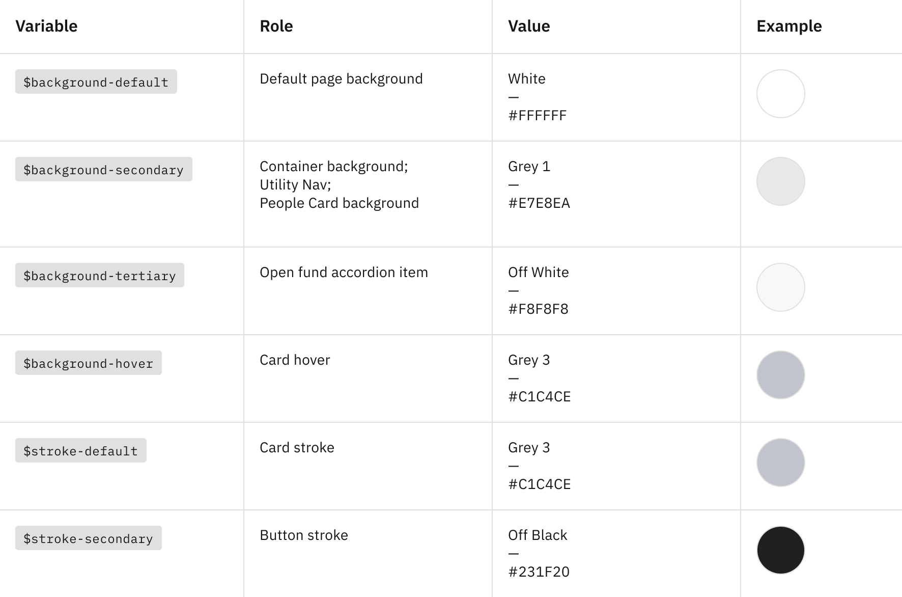
I started by establishing brand fundamentals like colour and typography, and presenting them clearly for future use.
To put my best foot forward, I followed IBM Carbon's well-respected design system structure. As well as itemising HEX code values for colours, I supplied a suggested variable for developer use:
In terms of typography, I interpreted the Brand team's print typography guidelines for digital, identifying the various heading sizes and adding them as text styles on Figma (complete with variations for different breakpoints).
Colour variables
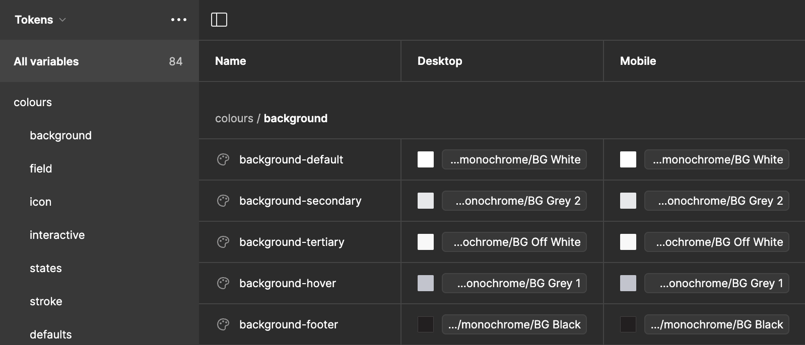
As soon as Figma's "local variables" functionality was released, I was able to implement this work inside the Figma tool:
Now, we can change a primitive colour in a single location and that change will be applied to all uses of that colour throughout the design system.
For example, if we swap our white from #FFFFFF to a less harsh #F5F5F5, this would update the 'background-primary' and 'text-inverse' colour tokens too.
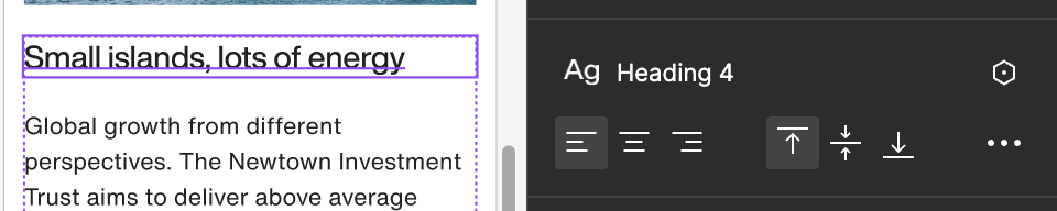
Typography variables
Similarly, I have recently defined the typography using Figma's local variables, with desktop and mobile variants:
This means that the typography can now change automatically depending on whether the frame is identified as a desktop or mobile screen size, bringing things closer to the HTML media query breakpoints that developers actually use.
2. Following atomic design
Following atomic design principles
I gathered the rough, mid-fidelity wireframes that had been created in the redesign project. I then started from scratch, taking them back to individual 'atoms' like buttons and dropdowns.
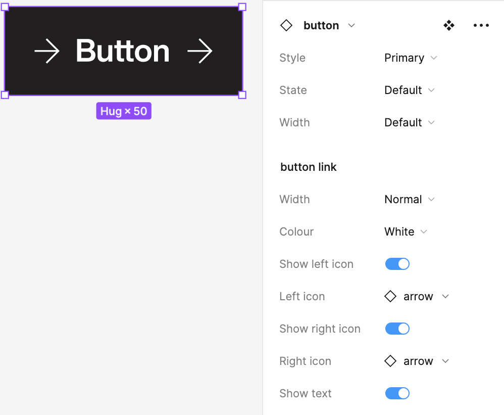
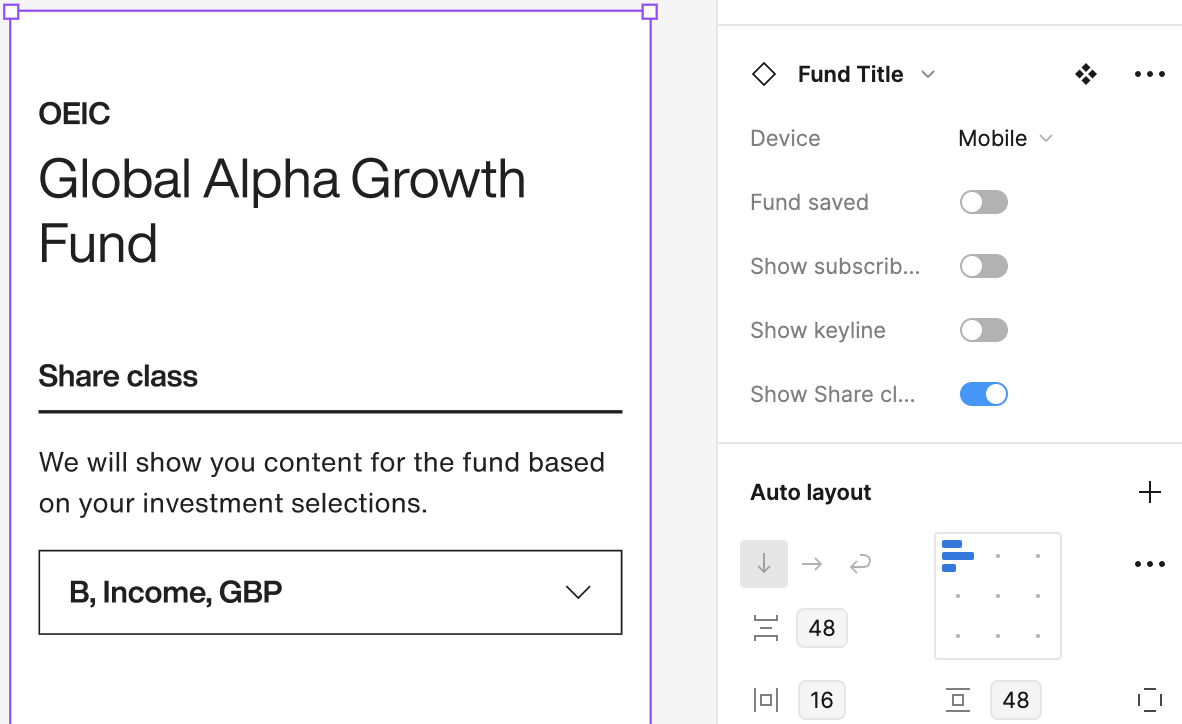
Adding component properties
I used future-proofed component properties, including styles, states, widths, font colours, and variable icon instances:
Building out Figma components
Once I'd sorted out the atoms, I could turn to the 'molecules', which aligned to panels in our CMS.
In general, I tried to make the component properties at this level as close as possible to the options available to our Content Management team.
3. Creating guidance for colleagues
Writing documentation
It wouldn't be a complete design system without detailed documentation.
I learnt from other design systems to decide what would work best for us.
I added a "Why this component?" section to explain the UX and accessibility thinking behind the design. Then the customary "When should it be used?" and "Where on the page can it go?" to set some guidelines for future designs.
I itemised all the customisations and options that could be set on the CMS in "What are the design options?", alongside a "What are the content recommendations?" to steer all future copywriting towards good UX writing practices.
Encouraging design system use
There's no point to a design system if it's not used, so it was important to then introduce it to the wider team.
I led meetings with the CMS managers to take them through the design system and to learn if there were any changes I could make to help their workflow.
For example, their feedback led me to rename the components from a traditional name (e.g. 'Accordion') to the name that they used on the CMS (e.g. 'People Panel'). Although this made the design system less tidy, it felt worth it to help encourage adoption.
The next thing to work on is Storybook and ZeroHeight integration, to put the design system somewhere it can be seen by all.