Handing designs off to developers
Finding design compromises to balance business and user goals.
Establishing an annotation system, clarifying behaviours and animations, writing user stories, collaborating with developers to solve problems, and championing key user needs.
Context
Time period
February 2023 – June 2024
Team
- UX UI Designer (me!)
- 2-4 Full-Stack Developers
- 1-3 Business Analysts
1. Preparing Figma for developers
Creating true Figma components
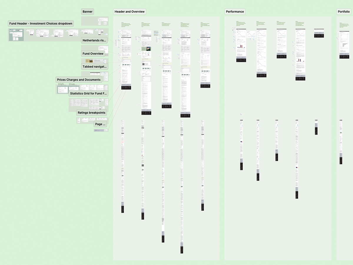
After the key designs of the website redesign project had been established (get the full story here), I took the designs, recreated them using proper Figma components, created a design system, and built mockups for pages in Figma.
Writing annotations
I established an annotation system as I felt it was important and efficient to clearly explain design decisions like interaction states, behaviours and animations before devs get involved, to save them time.
I can't show examples of this work due to privacy, but it was based on Femke van Schoonhoven's excellent YouTube content.
Creating user stories
I then worked with business analysts to translate these annotations into detailed user stories in Azure DevOps (similar to Jira) using Given-When-Then acceptance criteria.
Being involved in this process helped make sure that the UX team were guiding development and setting accessibility and functionality expectations for the later test and UAT phases.
I'm excited to use Figma's new Dev Mode to make this process even more detailed and efficient in future.
2. Revising designs
Collaborating with cross-functional teams
To keep up the pace of the project, I tried to help find design compromises to meet improve velocity while meeting business goals and championing the user (and accessibility, in particular).
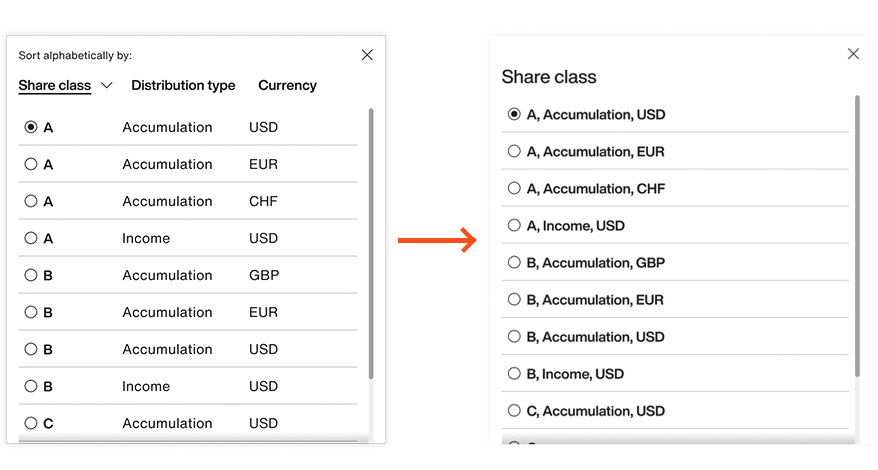
For example, we had a multi-functional dropdown that allowed users to sort an investment fund alphabetically by share class, distribution type or currency. This had been designed to be future-proof for some of our more complex funds, which had up to 15 options.
Throughout the project, I made sure to always be available for ad-hoc calls from developers.
This time, when discussing the dropdown with a dev, he cautioned that adding this sorting functionality would take considerably longer.
So I decided to analyse the data, and I concluded that this functionality would probably be overkill for three-quarters of the funds. Miller's Law tells us that users can keep around 7 items in their mind at a time, so I was happy that users should be okay dealing with all funds with fewer than 7 options.
That just left a handful of funds with more than 7 options.
Finding design compromises
I quickly mocked up a simplified version with no sorting, to see how it would look:
Looking at the mockup, I was satisfied that the content looked logical, as they mostly differed only by currency which looked easily scannable for users.
But I spoke to my UX Researcher and asked her to cover this on a usability test that we would run when the page is live.
Making informed changes
It only took a few hours for me to create the new mockup and think through the logic, but it saved many hours of valuable developer time – and (importantly) it shouldn't have a negative impact on the user.
It was then my job to create a design system, complete with documentation...
Next: Building the design system