About the project
Company
Baillie Gifford, Edinburgh
My role
- Solving a user pain point by creating clear new UI.
- Following brand guidelines and focusing on modern visual design.
- Getting validation through usability testing.
Time period
March 2024
Team
- UX researcher
- UX UI designer (me)
Problem
While testing a different feature, the UX Researcher noticed that users in certain locations were facing difficulty completing our 'audience selector' as part of site entry. 4 out of 10 users could not complete the task!
It seemed as though there was an issue with button visibility...
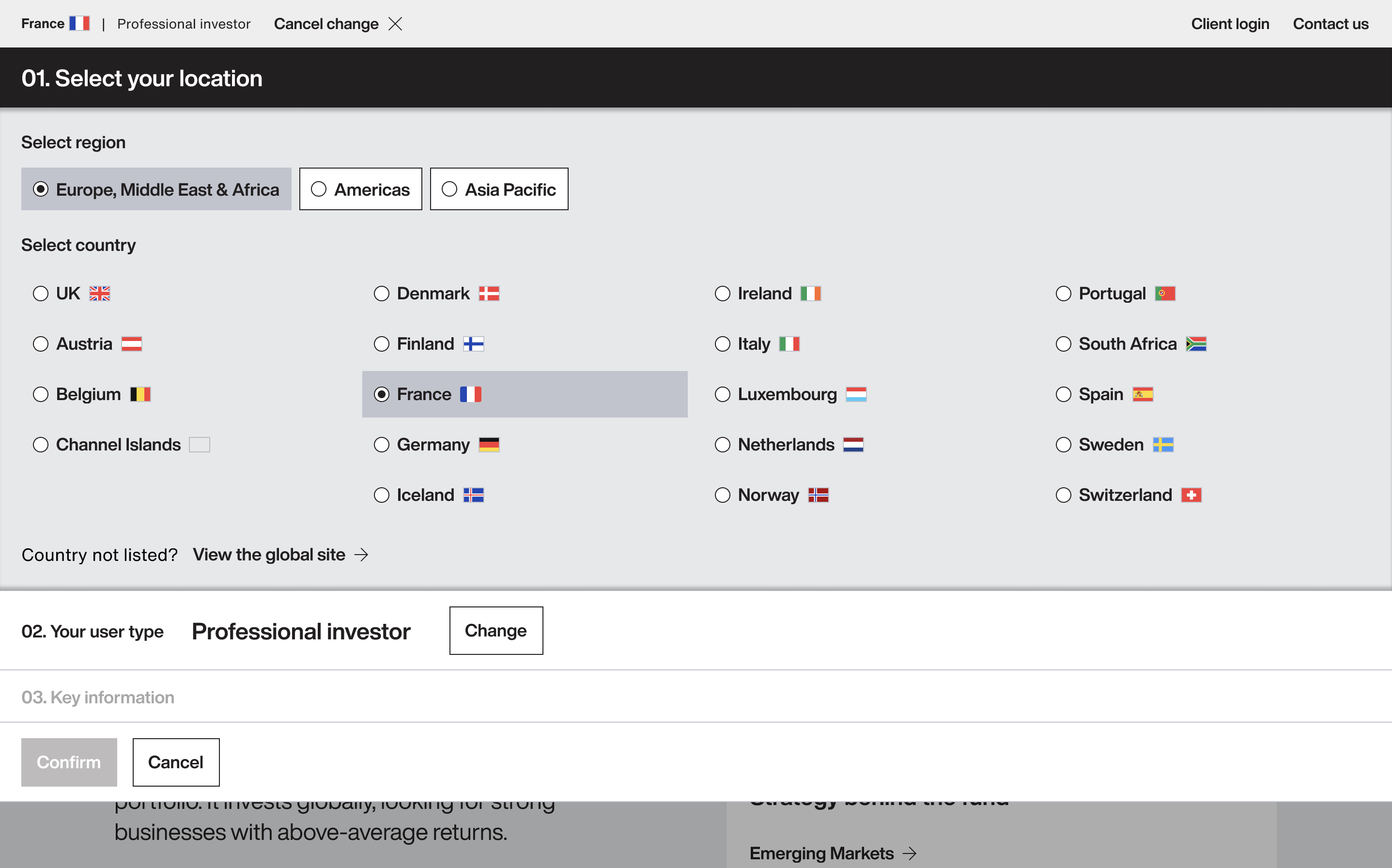
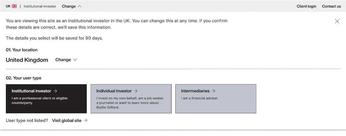
1. Identifying the problem
The audience selector is a component allowing users to change their location (e.g. UK) and their user type (e.g. Professional investor or Individual investor).
Watching usability tests
When originally tested, no issues had come up. But it hadn't been tested in scenarios where there was just one user type available.
Users weren't realising that they needed to click 'Professional investor' to proceed, and so were desperately clicking other areas:
For example, some users would take 23 seconds moving their mouse round the component, only to click the wrong button and be sent back to the start of the process:
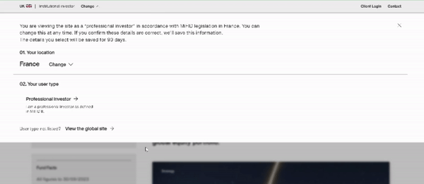
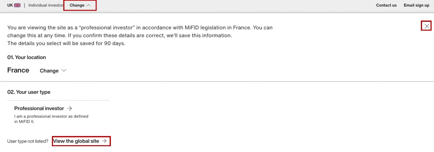
2. Testing a simple approach
Creating prototypes
I started by creating a few simple UI tweaks to see if we could make a significant difference with minimal dev time, while still trying to keep within the minimalist, monochrome brand guidelines.
For one version, I increased the font size for the button label text, and added a grey stoke around the buttons:
In the other version, I used more eye-catching background colours for the buttons:
These were then set up as prototypes in Figma, ready for testing.
Testing
Both options performed okay in testing, with 83% of participants completing the task, but we wanted to do better for such core functionality.
Users seemed to be looking for a way to apply or save the changes. And the component required users to make their selection in a specific order, which added some friction.
3. Starting from scratch
So I thought about what I'd have done if I'd designed the component from the start...
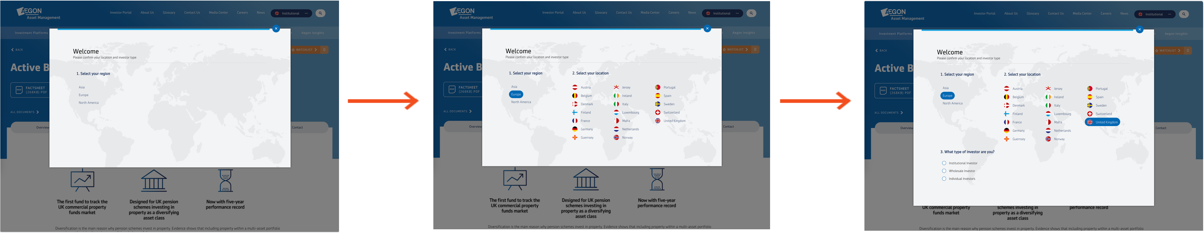
Competitor analysis
After taking another look at the available analytics, I conducted some competitor analysis and saw a few examples of sites using progressive disclosure to good effect, following a step-by-step process and only showing the information relevant to the user at each stage:
And some other sites that used radio buttons alongside a clear confirmation button: 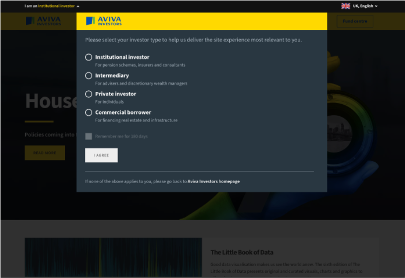
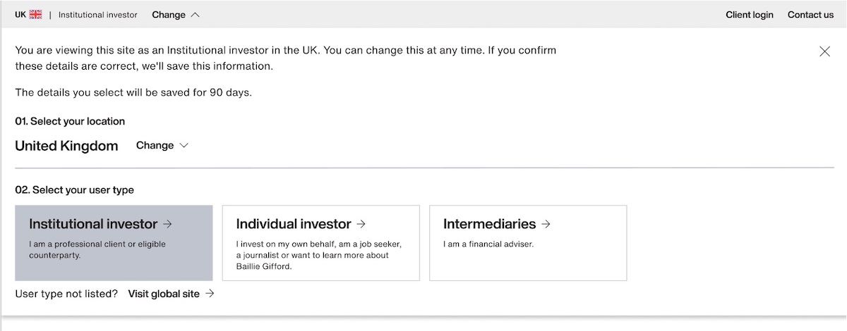
Creating and prototyping new UI
So I set about creating a new mockup of the component, introducing a clearer step-by-step process and an overhauled visual design.
I shared the Figma prototypes in a Design Crit and made a few tweaks based on feedback.
Testing and validating
All 6 participants successfully accomplished the task. Their perceived ease rating was a conclusive 4.8 out of 5.
The qualitative user feedback was positive: "the process couldn't be any better" and "self-explanatory and easy to interact".
I'm looking forward to seeing the success statistics when this is shipped on the live site!