
About the project
Company
British Film Institute, London
My role
- Establishing agile design processes to organise the team and to get design feedback.
- Creating a flexible design system in Figma to make future design more efficient.
- Learning from specialists in the business.
Time period
Nov 2024 - December 2025
Team
- Lead product manager
- Product manager
- UX researcher
- UX UI designer (me)
- Content designer
Problem
The BFI had committed to becoming more digital-first and wanted to try out a proper UX process to address user complaints about their cinema website.
Opportunity
There's only one UX designer and one researcher covering the whole business, so there's an opportunity to set up a design system to establish reusable components and to help define a stylish brand identity for digital.
1. Listening to customer complaints
Speaking to the audience insights team
When I joined, my colleagues had just completed research into the needs of 16 loyal visitors of our cinemas.One of the clearest pain points seemed to be a difficulty finding film information with minimal clicks.
So we read the results of a regular audience survey to learn more about the issue.
There’s nothing more humbling than reading customer complaints, but it’s very helpful! Feedback ranged from the constructive (“I really lack images in the list of movies” and “It’s not easy to find show times”) to the gloriously provocative:
"It’s a TERRIBLE website all around! The design, functionality and UX are maddeningly bad!”
Unhelpful film information
Evaluating the comments, it felt like the problem was about structure and consistency.
If you browse by date, the site lists all the available showtimes, but with no images or descriptions to entice the users to see the films:
But, if you browse by collection, the site gives attractive imagery and intriguing descriptions, but forces you to click into each and every film page to find the showtimes:
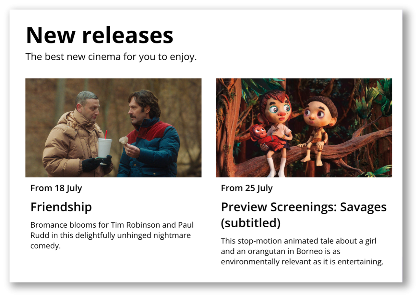
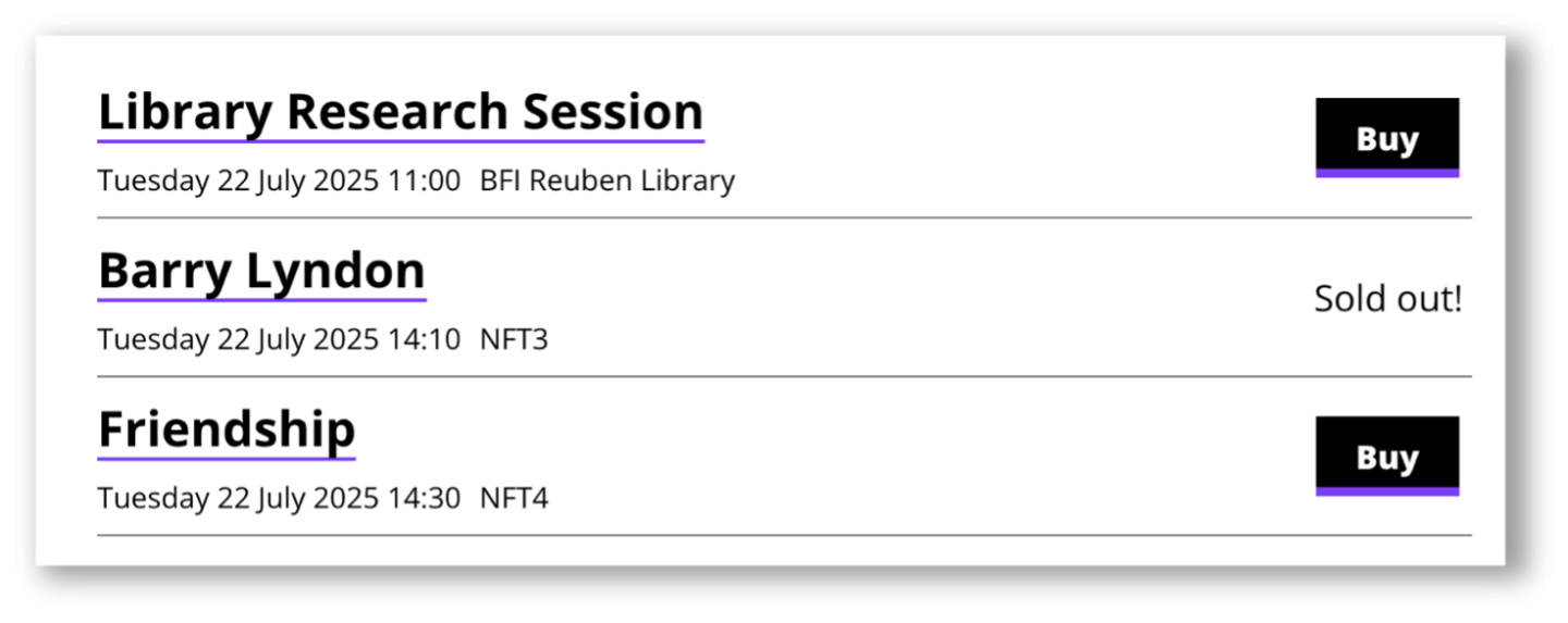
Users clearly wanted a way to get the best of both worlds, and so I designed the ‘showcard’: a component that combines images, titles, showtimes and more. To be used consistently throughout the site.
Validating the design
I encouraged the research team to cover users who hadn't come to our venue before, alongside the loyal 'frequent bookers', as I thought it was important to conduct research with potential new customers.
I suggested we test two versions – one 'Extra Small' card with minimal detail, and one 'Extra Large' card with a huge amount of detail to see what interests users about each.
I set up two interactive prototypes in Figma. I made sure to include some realistic film content to see if it overwhelmed users:
Ultimately, users liked the detail of the XL cards, especially the inclusion of the runtime, synopsis and year. But they preferred the way the XS cards were 'collapsed' by default and could then be clicked to reveal the upcoming showtimes.
Gratifyingly, both these cards performed well throughout the site.
2. Learning from the data
Slow same-day booking
Another comment from our user research caught my attention:
"If I want to just look at a glance what films are on that day at the BFI Southbank, it’s easier to look at Google.”
On the current site, to book a ticket for the same day, users must hunt down a small, tucked-away calendar tool – awkwardly placed over to the right on desktop, and sometimes hidden at the bottom of the page on mobile.
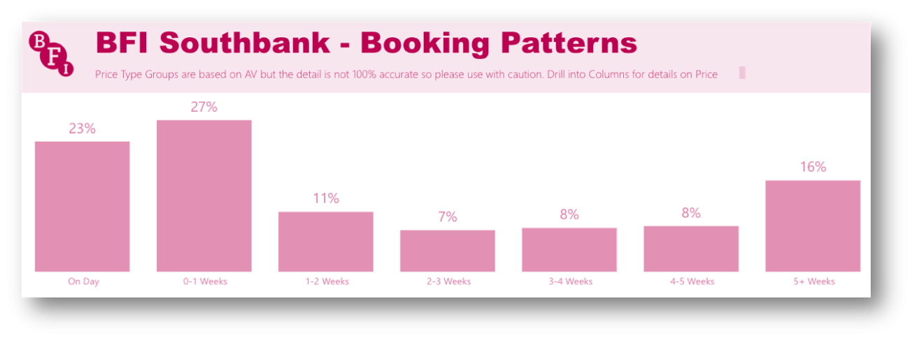
I checked a PowerBI report, which confirmed our suspicions: half of all bookings happen within a week of the screening, and almost a quarter are for screenings on the same day:
Prioritising quick booking
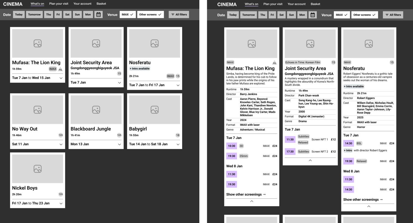
Our design response was to test buttons for ‘Today’, ‘Tomorrow’ and the rest of the week, along with a carousel highlighting that day’s films and events on the homepage:

These buttons proved hugely successful in our testing, with most users gravitating towards them and all users ultimately reporting that they were satisfied with the ease of booking a film.
3. Prioritising the BFI's unique selling points
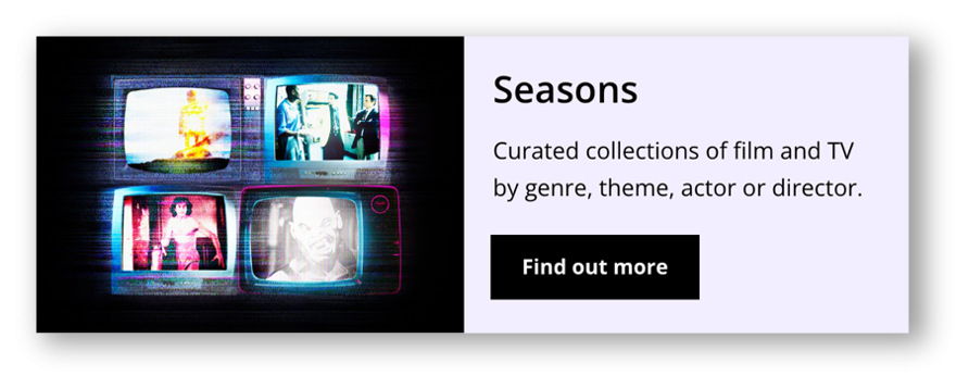
Seasons
A highlight of our Discovery process was a workshop we held with the team who pick the films. It was especially inspiring to see their passion for film and, in particular, to learn how important 'Seasons' were to the BFI.
Seasons are curated collections of films (or TV), organised by genre, theme, actor or director. Each one normally runs for a month.
For example, a Ridley Scott season which featured some of the director's best films.
It was a similar story when I caught up with the Brand team. These are the creative masterminds behind our iconic posters and artwork, so they know a thing or two about the importance of Seasons to the BFI’s brand.
It felt like Seasons were being let down slightly on the current site, as they were hidden behind an unexciting ‘Find out more’ link, increasing the interaction cost and relying too heavily on users knowing our programme structure and terminology.
So I applied the old scriptwriting adage of “Show, don’t tell”; I pulled a few of the top upcoming seasons straight on to the homepage and, for each season, I showcased some of the films that would be part of it. Finally, instead of simply listing season names, we were inviting users to discover more.
I also negotiated with the Brand team to define an improved visual design style to be used across BFI sites.
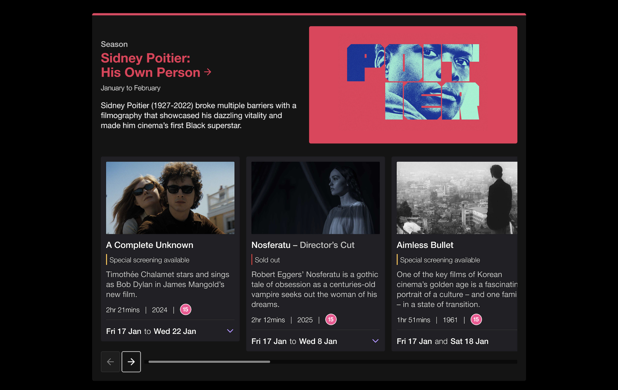
Suddenly, some of the most unique and exciting parts of our programme were being brought to life.